Do you want to add a chart to illustrate your data but don’t know which visual to use?
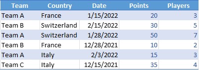
To illustrate data, it may be interesting to use graphs. From the table below, let‘s see how to do it.
Recommended Charts
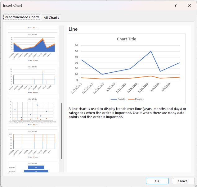
On the Insert menu, click Recommended Charts.
Excel offers you different visuals in relation to your data. In the left bar, you can move the elevator to see the different visuals on offer.
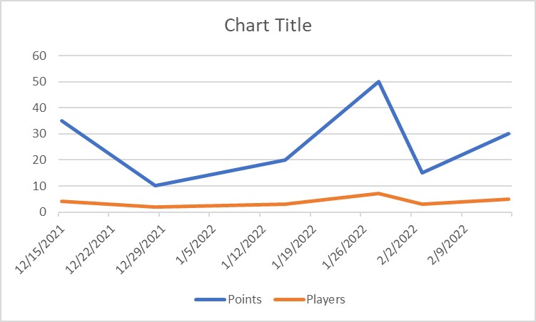
Once you have found what you are looking for, select it and validate by clicking on OK. You get the graph of your data.
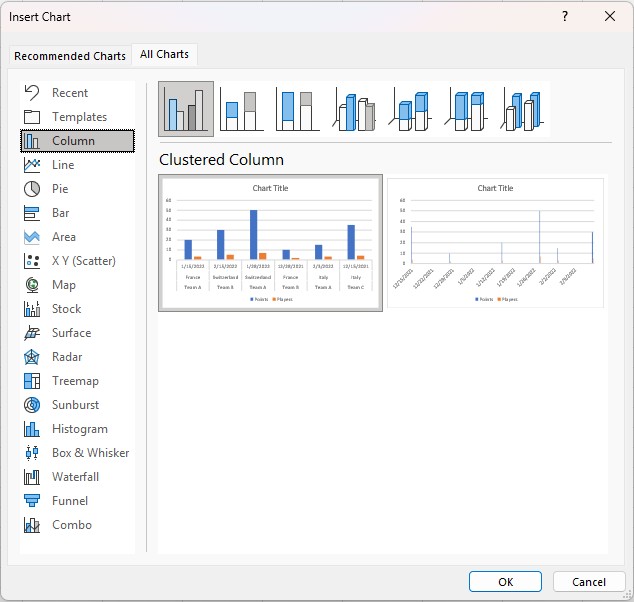
All Charts
In the chart insert window, you also have the option to see other types of charts. Excel gives you an overview based on your data. If no preview is offered, it means that the chart type is not compatible with the nature of your data.
If you already have in mind which type of chart to use from your data, you can select it directly from the Insert menu.
